Engineering firms rarely struggle for work to show. A business with decades of projects behind it can have hundreds: different sectors, different scales, different roles. The problem is presenting that body of work so a potential client can find what’s relevant to them in a minute or two, rather than giving up.
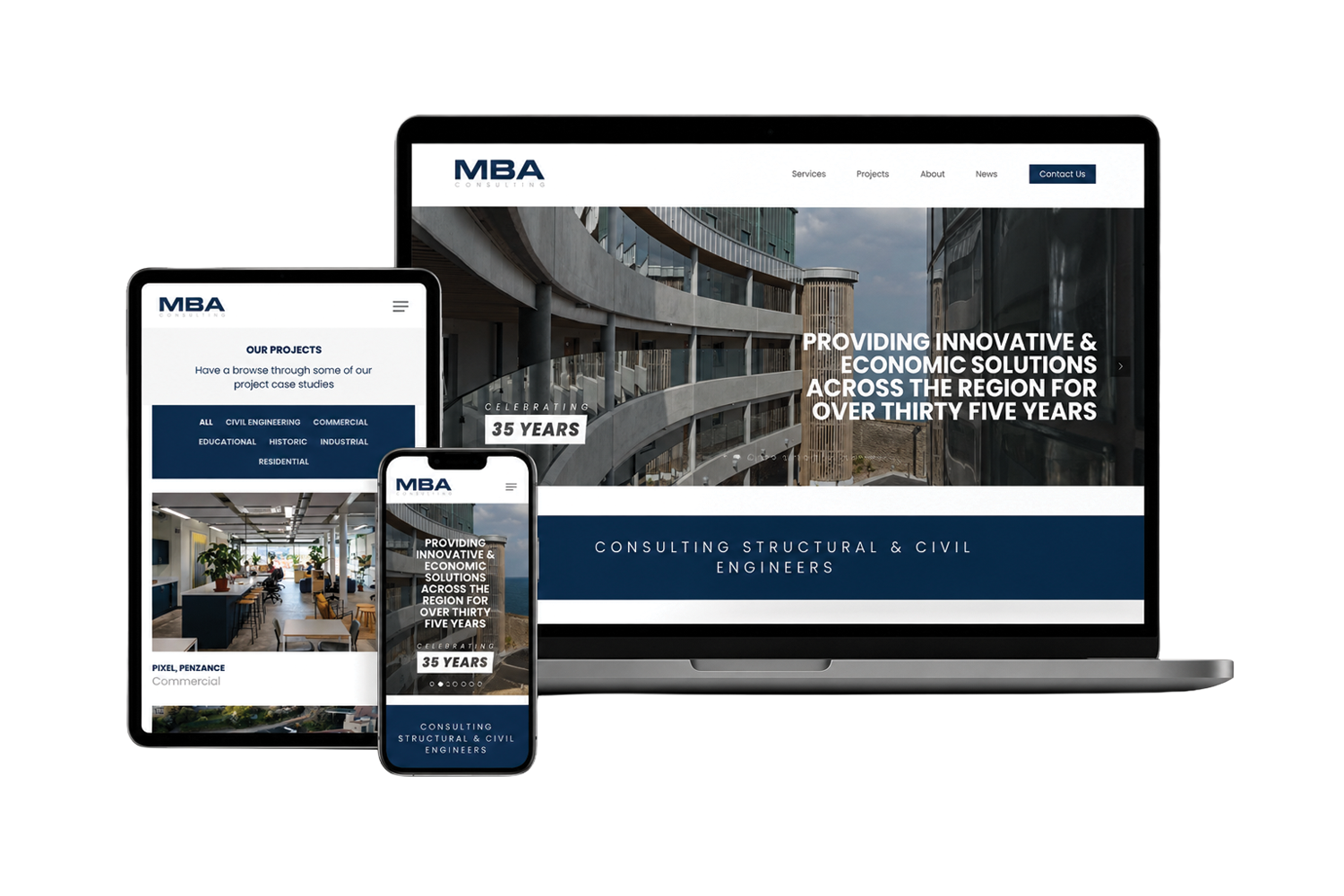
That was the brief behind the website I built for MBA Consulting, an engineering firm with over 35 years of experience and a large, varied portfolio. Here’s what I’ve learned about getting this right.
Start with who is actually looking
An engineering website is rarely read by one type of person. A homeowner planning a build, an architect choosing a consultant, a contractor checking capability and a procurement lead comparing suppliers are all looking for different evidence. Most of them share one question, though: have you done something like my project before?
The portfolio exists to answer that question quickly. Everything else about the structure follows from it.
Organise by how clients think, not how you file
Internally, projects are often filed by date, job number or client. Visitors don’t think that way. They think in terms of the kind of work: the sector, the type of building or structure, the service involved.
For MBA, the first job was to organise the projects into categories and give the portfolio a clear hierarchy, so a visitor can go straight to the relevant type of work instead of scrolling through everything in date order. The navigation and content structure were simplified around that.
A good test is whether someone could answer “have you done this before?” in two clicks from the homepage.

Let the work do the talking
Engineering projects are often visually strong: structures, sites, finished buildings. That imagery is more persuasive than paragraphs of description, so the design should get out of its way.
On the MBA site, the layouts are image-led and the interface is deliberately restrained. The visual identity itself came from the firm’s brand partner, Cornwall Creative, and my job was to carry it into a website that lets the photography lead without becoming cluttered.
Give every project page the same shape
Once there are more than a handful of projects, consistency matters more than flair. When every project page follows the same pattern, visitors learn where to look, and the business can add new projects without redesigning anything. A useful pattern is:
- the type of project and sector, so it can be categorised;
- a short summary of the challenge and what the firm did;
- a strong set of images;
- a clear route back to related work, or on to an enquiry.
It doesn’t need to be long. It needs to be easy to scan and easy to repeat.
Make it easy to keep up to date
A portfolio that stops being updated quietly works against you: a prospective client sees nothing recent and draws their own conclusions. So the site has to be something the team will actually maintain.
MBA’s site runs on WordPress with a portfolio system built for adding projects, and the handover included a one-hour training session with their content manager, covering how to create and maintain blog content. The aim is that the firm can manage the site independently, without needing me for every new project.
Common mistakes to avoid
- One long chronological gallery. It shows volume, but makes relevant work hard to find.
- Portfolios hidden in PDFs. They’re slow on a phone and invisible to search engines.
- Stock imagery. For an engineering firm, real project photography is the evidence. Generic images undermine it.
- Too much text, too early. Lead with the work and keep the detail for those who want it.
- A structure only the developer can update. If adding a project needs outside help, it won’t happen often enough.
Where to start
If your firm has years of strong work but a website that doesn’t show it, the first step is usually an honest look at how the projects are organised, not a new design. If you’d like a second pair of eyes on that, you can start a project or get in touch, and you can see more about how I approach websites on the web design page.