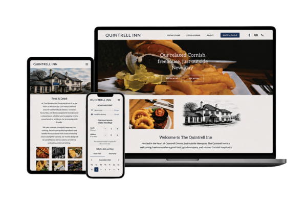
A website can look excellent and still be awkward to use. Often the difference isn’t a big redesign, but a handful of small decisions about where things sit, what happens when you tap them and what’s there when something goes wrong.
These are some of the details I pay most attention to, with examples from real projects.
Keep the main action within reach
On a phone, the header scrolls away quickly. If your most important action lives only there, people have to scroll back up or open the menu to find it.
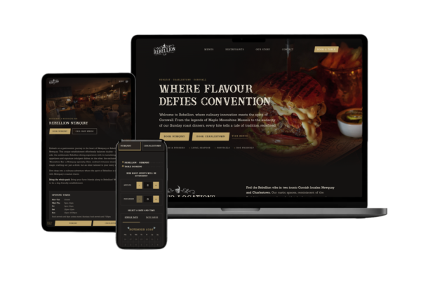
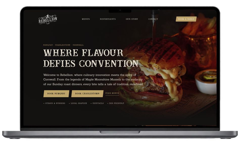
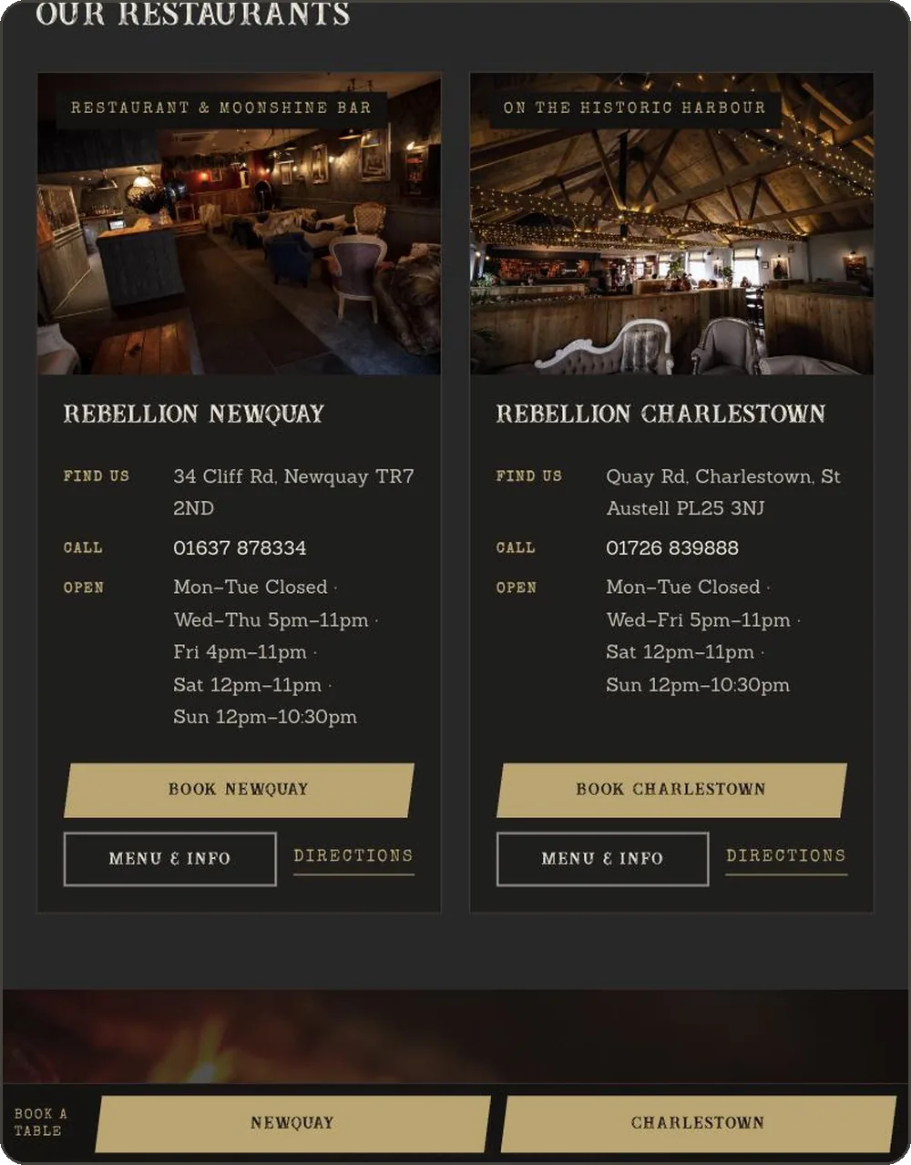
For Rebellion Roast House, the answer was a slim booking bar fixed to the bottom of the screen on phones and tablets, where a thumb naturally rests. The detail that matters most is that it isn’t always there: it hides on the booking page, where it would only duplicate what’s on screen, and desktop uses a header button instead. A floating element earns its place by being useful, not by being permanent.
Carry the visitor’s choice with them
When someone has already made a decision, don’t ask them to make it again. On the Rebellion site, booking buttons on a venue page open the booking form with that restaurant already selected. It removes one small, irritating step at the moment it matters most.
Put practical information in the same place every time
People scan; they don’t read. If address, phone number, hours and the main actions always appear in the same order and the same style, visitors find them without thinking. Rebellion’s two restaurants each have a card with the same layout, ending in the same three actions: book, menu and info, directions.
Offer a second route
Not everyone wants to use the main form. Some people would rather message, call or read more first. Zodiac Interiors gives customers clear routes to book a measure or get in touch by form or WhatsApp, along with downloadable brochures for people who aren’t ready to talk yet. On booking pages, a simple “open in a new window or call us” link under an embedded form means a technical hiccup never becomes a lost customer.
Let people zoom
Some older website setups stop visitors from pinch-zooming on mobile. It can make a layout feel neater, but it makes text and images harder to read for anyone who needs them larger. Restoring zoom was one of the quieter improvements in the Rebellion rebuild, and it costs nothing.
Put trust where decisions are made
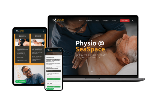
Reviews and testimonials work best close to the point of decision, not hidden on a separate page. On the Sands Physiotherapy site, existing client reviews were given prominence throughout, as an important layer of reassurance for people deciding whether to book.
Write image descriptions properly
Alt text helps people using screen readers and helps search engines understand your images. “Image1.jpg” or “website on a laptop” tells nobody anything. A sentence describing what the picture shows takes seconds to write.
Attractive and useful aren’t opposites
None of these details stops a website looking distinctive. Rebellion’s site is as bold and dark as the restaurants themselves. The point is that every visual decision should also make the next step easier, or at least not get in its way.
If you’d like a fresh pair of eyes on how your website works in practice, you can start a project or get in touch. You might also find refresh or rebuild? useful if you’re weighing up bigger changes.